Mercari ISO (In Search Of ) Feature
Background:
Mercari is a C2C marketplace where users can buy and sell items they no longer need or want. Mercari’s main product is its app, which was first launched in Japan in 2013 before expanding worldwide in 2014.
Context:
Add a feature to allow users to make “in search of” (ISO) posts for specific items they are seeking out. With this feature, those who have that item will be able to offer and notify the user they have the item they are seeking out.
Time: 75 hours, Oct 2023
Role: UX/UI Designer and Researcher
Tools: Figma, FigJam, Whimsical, Maze, Google Meet
Research
For my overall research goal, I want to know what current users of Mercari valued so that I could understand how an ISO (In Search Of) feature would benefit their user experience.
I used the following research methodologies: Competitive Analysis and User Interviews.
Competitive Analysis
I conducted a competitive analysis of Mercari and three other online marketplace apps. This included Poshmark, Depop, and eBay. I compared these four across strengths, weaknesses, and key features across all apps.
Each platform has its own unique feature set, however, none have an ‘In Search Of’ feature to aid users in their search for a specific product.
User Interviews
To better understand Mercari users’ experiences with searching and browsing for products they are looking to buy. I conducted interviews with five participants who are users of Mercari.
I asked questions about the following:
Positive and negative shopping experiences
Items they typically bought second-hand
What information they look at before buying an item
What their search experience was like on apps like Mercari
What was their next steps should they not be able to find the item they need in their search
Insights
Users generally aren’t deterred if their initial search results do not yield the item/s they are looking for.
Participants did express frustration with seeing unrelated items showing up in their searches due to how certain keywords are picked up.
Participants looked at various parts of the listing before making their purchase.
Some participants wished there was more communication from sellers. As well as a more social aspect to the Mercari platform.
Users liked the various categories and filters you could add to their searches. Some expressed wanting a way to refine their search even further.
Some participants were familiar with “ISO” posts. This included seeing them on the platform, as well as making one themselves in hopes of finding an item they really wanted.
Define
From my research, I began to synthesize my findings to identify common pain points and other problems Mercari users have.
Affinity Map
Through my affinity map, I was able to identify the following common themes and patterns. I identified patterns in the following categories:
Shopping experience, both good and bad
Searching experience
What is missing
Items bought
Apps used
Information looked at before buying
Problem Statements
From my research, I was able to come up with the following problem statements and questions. These will be used as I guide as I begin the ideation process.
Users would like clearer and better communication channels between buyers and sellers. This includes more detailed listings, quicker replies to messages, as well as clearer communication on shipping and other updates from the buyer. Users also emphasized wanting a more social and human aspect to the buying/selling process despite being online.
Users expressed they enjoy searching for items they want or need, and are generally not deterred when they are unsuccessful in their initial search. Users would like a more detailed way to search and better ways to filter their search to see the items they want.
How might we find better ways to connect sellers to buyers with the items want and buyers to sellers with items they have?
How might we find additional ways to assist buyers in finding items they want?
How might we add a greater emphasis on communication and socialness to users?
How might we add a more human element for Mercari buyers and sellers?
User Persona
Thea was created based on my user interviews and other research. With my user persona, I was better able to understand the user’s needs to guide my project and the feature I was adding to Mercari.
Thea uses Mercari to save some money on new clothes and camping gear.
She also uses Mercari to sell unwanted items to make some extra cash as well.
Her goals are finding a good deal and finding items she needs quickly and easily.
She is easily frustrated by poor communication from sellers and unrelated items showing up in the search results.
Ideate
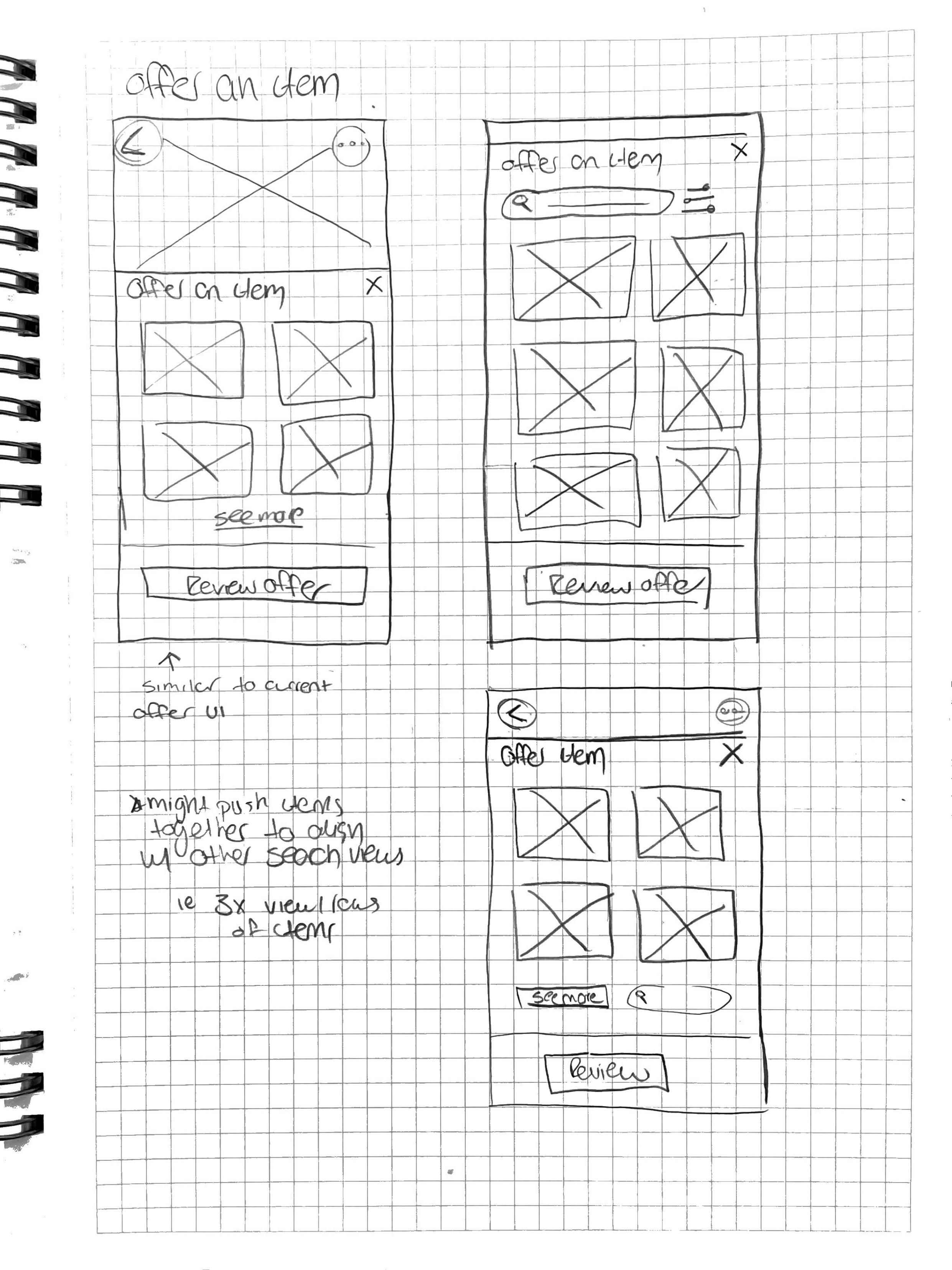
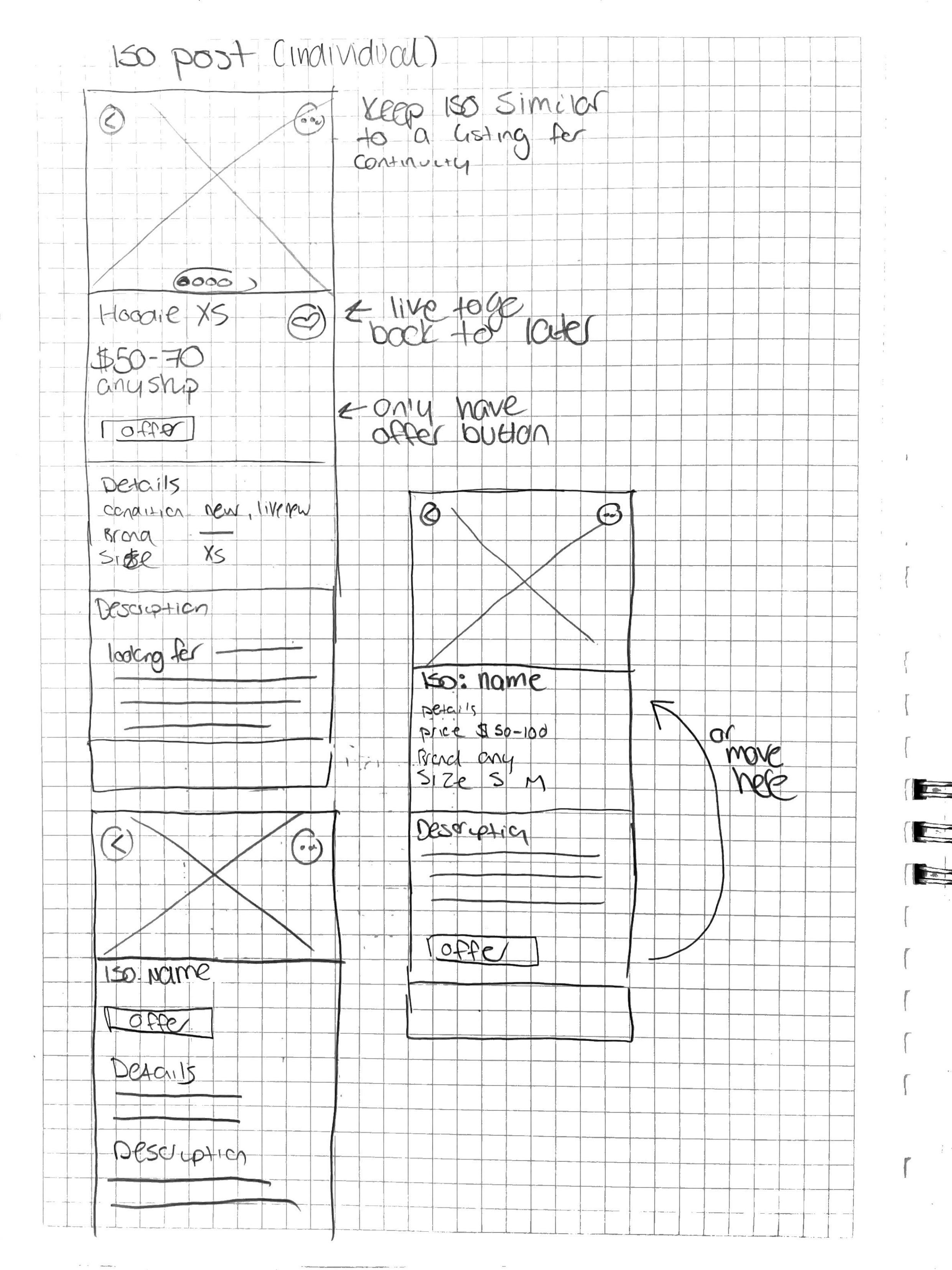
After my research, I began to develop ideas and potential solutions. To begin bringing my ‘ISO’ feature to life, I began with some sketches to plan what this new feature might look like.
Task Flows
Before I started sketching, I created the following task flows. These were used to imagine and plan what the user would go through with the “In Search Of” feature.
Sending an offer to an ISO post
Create an ISO post
Receiving an ISO offer
I also tried to keep these flows similar to existing task flows on Mercari as to fit in with the current UI, and to provide familiarity to the user.
Sketches
I used sketching as an opportunity to play around with different ideas and layouts, while staying within the constraints of Mercari’s current UI design.
My primary goal with my sketches was to find an innovative way to include the planned “In Search Of” feature that made sense and fit in seamlessly. Mercari’s home page makes use of tabbed sections and this is where I decided to include the new section. I also used sketching as an opportunity to re-work existing pages to fit into my new feature. I re-designed a typical Mercari listing to be an “In Search Of” post one would make.
Design
This is where I started to bring my ideas and sketches to life. This included creating mid-fidelity wireframes, and testing before eventually creating hi-fidelity mockups of the ISO feature on Mercari.
Mid Fi Frames
From my sketches, I took my top and favorite ideas to build out to a mid-fi level. I used my mid-fi frames as an opportunity to solidify my design choices. I also used it as a way to make sure my design choices fit in with Mercari’s existing UI.
Mid-Fi User Testing
I also conducted a mid-fi user test before making my hi-fi frames. I also used this as an opportunity to confirm my design choices and see if I needed to make any changes.
Task Tested: Searching for an item under the “ISO” tab and offering an item to the person searching for it
Results: Overall, users were able to complete the task with ease. I received great feedback on how to further improve the feature as well.
Patterns Observed: Expecting the “ISO” button to be on the home page instead of a filter under search. This seemed to be the only pain point for my participants as the rest of the task was completed with ease.
Next Steps: Add another option to access “ISO” posts. This will most likely be added to the homepage as it will align more closely with the current UI of Mercari without drastically changing its current layout.
Hi-Fidelity Prototype
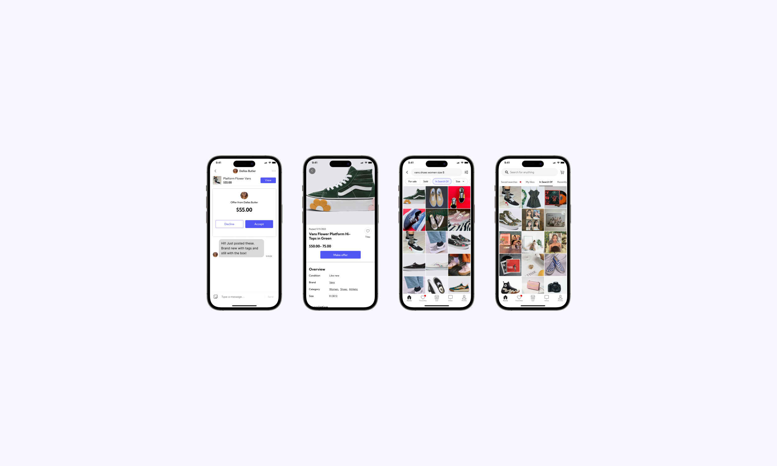
With the feedback and results from my mid-fi test, I created the following hi-fi prototype of the “In Search Of” feature. This primarily included implementing a secondary to to access the “In Search Of” section on the home page.
Test
I then conducted my user testing with five participants. I tested the following flows during my user test:
An intro to the new feature via Mercari notification
Search for an item and send an “ISO” offer
Accept an “ISO” offer
Goal:
The goal is for users to successfully, efficiently, and seamlessly navigate through three user flows of a new feature added to Mercari. The goal is also to gather feedback from users on their overall experience as they interact with the new “In Search Of” feature.
Success Metrics:
Tasks are completed efficiently
Tasks are made without any error
Feedback is given on overall experience
Results
Overall, I found my usability test to be successful, even with flows that resulted in errors. I reached my success metrics of successful and efficient completion or feedback to result in a successful completion. The following is some feedback I received on each task:
Learn About New Feature
Users expressed how they liked having the announcement of a new feature at the top of their notification inbox
Send an ISO Post
Users expressed wanting this feature a bit more prominent on their homepage.
Users also expressed wanting a secondary way of accessing it.
Some users were confused by this flow. I think it was a combination of my instructions and the overall nature of the task.
Accept an ISO Offer
Users found it easy to navigate to the new message with the offer.
Users liked the large box to accept or deny the offer in the message.
Iterate & Final Version
From my findings in my user tests, I was able to make the following change to my final high-fidelity prototype:
My primary change was spelling out “In Search Of” instead of abbreviating it to “ISO” based on the feedback I received from user testing.
Reflection
Instructions are everything!
One of my biggest takeaways from this project was how important instructions are when user testing. During user testing, I discovered some of my task flow instructions had too many steps which caused confusion for some of my participants. Throughout my tests I had to quickly think of ways to re-word my instructions in the moment so I could get accurate results.
I felt this experience assisted in making me a better test facilitator, as well as helped me create better user testing plans for future projects.


